top of page
Personify Health
Reimagining health notifications experience for 25 million global users
Timeline
Apr- Jun 2025
Devices
Web, iOS/Android
Role
Research, Wireframes, Interaction design, Hi-fi Prototypes, Usability testing, A/B Testing, Design system components, Accessibility checks

context
Personify Health is a comprehensive health and wellbeing platform that combines personalized daily health tracking, mental health support, and benefits navigation into a single platform for 25 million global users.
The team

the problem
The Settings & Notifications experience hadn't kept up with the platform and members were experiencing it. As Personify Health scaled, three cracks became impossible to ignore.
High
interaction cost
Members struggled to find specific notification types, leading to missed communications.
Scaling
without structure
New notification categories were being added, but the existing design had no framework to accommodate growth.
Visual Inconsistency
The experience was out of sync with the Groove design system, creating a fragmented, unpolished feel for members.
"I didn't even know I had rewards waiting for me. I never got a notification about it...."


final solution
I prepared specs for engineering and pressure-tested every design against accessibility standards during refinement meetings, before handoff.
Web
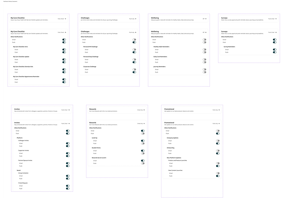
Accordions organize a dense settings page into one scrollable view. Auto-save toggles keep members in flow, while collapsible headers make any category one scan away.

Mobile
The two-click flow keeps categories scannable on small screens. Auto-save toggles remove the global save button and the risk of lost changes that came with it.


impact


core requirements, constraints and business goals
Partnered with the Technical PM, Lead PM, and Design Lead to understand the problem deeply, align on core requirements, and ensure we addressed both user needs and business goals.
the strategic question
How would members mentally organize their notifications? Until we answered that, we couldn't fix what was breaking.
A collaborative workshop with UX Research, covering information architecture, categorization, card sorting, and tree testing, surfaced two distinct models. The only way to know which worked better was to design and test both.
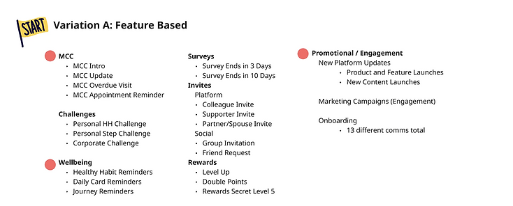
Notifications grouped by specific platform features: MCC, Challenges, Rewards, Surveys, Invites

Notifications grouped by member-facing themes: Health Reminders, My Programs, Social, Onboarding

insights to defining the north star vision
“How might we redesign the Settings & Notifications experience to be visually consistent, scalable, and intuitive enough that members never miss an important communication again?”
Clarity & Findability
Make it easy for members to find, understand, and control their notification preferences in fewer steps.
Scalable Structure
Build a notification architecture that accommodates new categories without breaking the experience.
Visual Consistency
Align the experience with the Groove design system across web and mobile.
defining success
Goals were defined collaboratively with the Technical PM, Lead PM, Design Lead, and Senior UX Designer to pressure-test requirements against both user needs and technical feasibility.
Task efficiency
Cut the time and effort it takes members to find, manage, and configure their notifications and reduce the support volume tied to settings confusion.
Member engagement
Get members opening, acting on, and trusting their notifications rather than dismissing them or turning
them off entirely.
Design system check
Bring every component into alignment with the design system to reduce tech debt and create a foundation that scales as new notification types ship.
the muscle memory check
What patterns do members already expect? Designing against convention would mean fighting muscle memory.
I looked at how other popular platforms handle notification preferences. The patterns were consistent.
System-native toggles (iOS UISwitch / Material Switch), scrollable screens without save buttons, and primary controls within thumb zone.
One rule held across every app: email and push are always controlled independently, never bundled.


early explorations
Two variations. One goal: find what felt most natural for members.
Two-click flows and checkboxes. Pulled the Technical PM, Lead PM, Design Lead, and Sr UX Designer for feedback on technical feasibility, product requirements, design system constraints & UX consistency.


the pivot
Two pieces of feedback changed everything.


getting creative, integrating feedback, continuing explorations
Stuck between two imperfect options, I pitched ideas based on research to solve both and create something new.


engineering feedback
We pulled in engineering to validate whether toggles could be implemented and if accordions could be built as a new component with the timeline in hand. Got the green signal and moved to testing.
the validation question
How do we know this is the right call? Partnered with our Senior UX Researcher to run two rounds of usability testing.
Round 1: Testing interaction designs (A/B testing)
Mobile/Web, tested 2 click flows vs accordions
Round 2: Testing both variations from research workshop
Mobile/Web, compared variation A vs B
testing results
On mobile, the 2-click flow outperformed accordions. On web, accordions outperformed the 2-click flow.
One pattern, opposite results
Accordions improved findability on web but broke scannability on mobile. The variable was screen real estate, not the pattern itself.
Scannability scaled with screen real estate
On web, collapsed accordion headers gave members a map of all categories. On mobile, a single expanded section filled the screen erasing any sense of overview.
Multi-category tasks caused friction on mobile
Members updating several categories on mobile had to repeatedly expand, collapse, and scroll. On web, scanning headers let them jump.
testing results
How should notifications be categorized? Members located notifications faster when categories mapped to platform features they already used daily instead of abstract themes.
design system contribution
Built for the project. Adopted by the design system.
Groove's existing accordion was outdated. The version I designed for this project accommodated for new features like notifications summary and had better visual design touches.

key learnings and outcomes
Collaboration creates better experiences.
Constraints are design opportunities
Groove's limitations pushed me toward native mobile patterns that members already knew.
Design systems are living, not static
Contributing to Groove taught me that using a design system is only half the job and evolving it is the other half.
Collaborate early, align often
Bringing engineering and design leads in before high fidelity caught misalignments before they became expensive to fix.
Anchor 1
bottom of page